Mood Board

For the mood board I decided to explore the theme and genre of rock and the sub genres. I used the internet and music magazine to collect ranges of images and font styles and colours. Instead of using a word document I decided to print and cut on to a A3 paper and ripped the sides and edges of the images to create a rock and rough effect. I noticed most colours were dark including colours: red, black and white; which can be typically linked with rock music. It was clear there was a contrast of backgrounds to font such as black background with a white font or white background and black font. From the mood board I can see that images of bands and artists are vintage and in a old fashion style which links with indie rock and folk rock. Many images are either in black and white or have been edited to give a sense of vintage and uniqueness. The style of the images is serious which reflects on the dark aspect of rock magazine. Some paragraphs seem to be captured randomly, which shows a chilled and relaxed bands making rock music seem relaxed and fun. It's noticeable that the writing is in capitals suggesting that rock music is loud and the use of 3D effect on some font created the idea that rock music is interesting and modern. I can see from the mood board that the clothing style which is common for rock music is dark and contains leather but for indie rock music clothing is simple, vintage and in vintage causal suits. This shows that when I create a indie rock magazine that the clothing in the front cover image should be vintage type and casual at the same time. This mood board would help me develop ideas for my own music magazine by giving me examples of front cover image such as the black and white style of front covers. I personally like the black and white images, because it can be typically linked with folk and indie rock sub-genres but also gives a vintage feel towards the image. I also like the blue colour because it stands out from the other colours which could be used for the masthead.
Questionnaire
I carried out a questionnaire, designing one specially for rock music fans because I already decided to create a rock magazine therefore I wanted opinions from rock fans so that when creating my magazine it would be more easy to know what decisions to make and why. I asked around 11 people ranging from males to females and a range of ages; so that my research can be developed and that I could gather a range of ideas and views. I then put all the results on a graph so I could analyse the results more easily.

|

|
Results

|

|
From the results, the most which I could find were females which liked rock music however, many rock music magazines are designed for males. Therefore, this shows that there could be more females liking the rock music instead of males. The age range was mostly between 16-18, which could show that the magazine I'm creating should target that age range.

|

|
5 out of 11 said they sometimes read music magazine, which shows that not all rock music fans buy magazine. This could be due to the magazines in the market and the type which are commonly targeting males. I also asked which magazines they read and 7 out of 11 said 'NME' showing this style of magazine is most liked. There were 0 who read 'Top of the Pops' and 'Vibe' clearly showing this type of magazine isn't liked.

|

|
9 out of 11 said 'Alternative Rock' was their favourite rock music sub-genre, and 5 out of 11 said 'Indie Rock' which is second favourite. I also asked what other music genres they liked and 7 out of 11 said 'pop' which shows the people who answered the questionnaire have a range of favourite music genres.
|

|
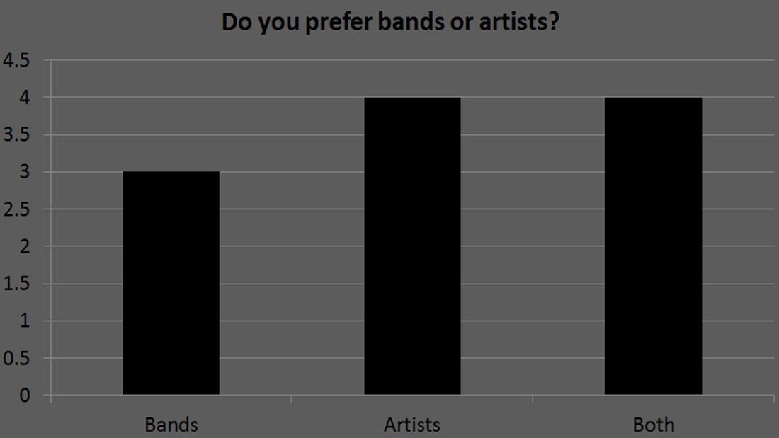
I asked whether they preferred bands or artists, 4 out of 11 said both, and the same said for artists and 3 out of 11 said bands. This shows me that rock music fans prefer both mostly and artists rather than a band. I also asked what attracts them to music magazine, 10 out of 11 said front cover image attracted them mostly to a magazine which tells me that when creating a music magazine that the front cover must be the right shot to attract my target audience. Coverlines also attracts magazine readers, with 8 out of 11 saying it attracts them to purchase a magazine. This informs me that the coverlines must be interesting and be what the reader wants.

|

|
7 out of 11 said that a vintage style of music magazine would be liked the best showing me that the magazine I will create must be in the style of vintage so that the target audience would like the style. 6 out of 11 said dark and 5 out of 11 said rocky, which is a typical rock music magazine therefore I would avoid this style, so the magazine I create can be different and opposite to a typical rock music magazine. I also asked how often they purchase music magazine in a month, mostly said 1 to 2 and 3 out of 11 saying never.

|

|
I also thought asking them how much they would pay for a magazine without a free CD and 8 out of 11 said £2-£3 and I asked how much they would pay for a magazine with a CD and all said £3-£5. Showing me that my magazine should be priced around £2-£3 so the magazine could be bought by the target audience.
|

|
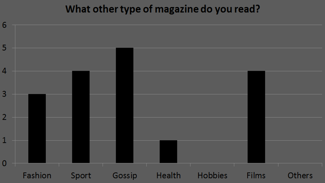
I asked what other types of magazine they read, which would help me to see what other features to include in my magazine. 5 out of 11 said gossip; this is because mostly females answered the questionnaire. 4 out of 11 said sport and same for films showing that this could be included in the rock music magazine because some magazines features fill articles and reviews. I then asked what adverts they would expect to find in a music magazine and 10 out of 11 said concerts/gigs which show me that articles and coverlines should include this, so it would attract the target audience. 7 out of 11 also said events, including ranges of concerts, gatherings and meetings which could also be coverlines for the front cover.

|

|
I then decided to ask which features/articles that would interest them most, all said music charts and 10 out of 11 said interviews which show me that those types of articles should feature in the magazine. 5 out of 11 said award shows and same for news including about artists and current music. Then I asked what they disliked about music magazines and 7 out of 11 said articles which don't interest them is what they disliked most, showing me that the articles must be what the reader wants clearly. 6 out of 11 said competitions are what they disliked the most telling me that I shouldn't include competitions in my magazine.
Focus Group
To gather more information and opinions on different music magazine which include the genre rock, I decided to a do a focus group talking two females who are fans of rock music. I showed them a range of front covers to see which they liked the best and which they disliked. I also showed them the mood board I created, which led to a discussion about what they liked from the mood board and not.
Front Covers Shown

Image 1
|

Image 2
|

Image 3
|

Image 4
|

Image 5
|

Image 6
|

Image 7
|

Image 8
|

Image 9
|

Image 10
|
Screenshots of Focus Group Video

Front Covers & Content Pages
|

Moodboard
|
Results
I first showed the ranges of front covers, including music magazine such as: NME, KERRANG, Q, MOJO and CLASH. I asked which front covers they liked the best and they replied saying that CLASH (image 6) was their favourite because they found it simple yet effective by the use of colours and the bright red lipstick contrasting to the blue background. They also said it was classy because it wasn't too much and didn't have writing around which also made it simple. They disliked Q (image 5/9) and KERRANG (image 2/4) because they found it "too busy", in other words it had too much writing on the front and it didn't seem classy for them. I asked whether boys preferred the KERRANG magazines and they replied saying it depended on the individual and their taste.
I then asked what style of images they liked and they replied that close ups and mid-shots were their favourite and they said MOJO (image 8) was their least favourite because they preferred seeing the artist/band's face because it's more likely to attract them to the magazine. I showed them NME (image 7) and Q (image 9) contents page and compared each other to see which they liked, however they said both were "too busy" meaning there was too much writing. They also said it was hard to understand and preferred the contents page to be simpler and more in order with the number pages list. I also asked which colours they liked for a front cover and they said that simple was much better which were calming colours and one said "NO RED!" because she always see's red colour used for a rock style magazine. The other said that they liked CLASH (image 6) because the colours contrasted and that the red stood out and that it's better when colours are dimmer and then one random colour to make the front cover to stand out.
I also showed them the mood board which I created to see what images style they liked and fonts and colours. I first asked them what images they liked and they thought black and white were the best with headshots so they could see the artist/band. They said no text for images especially for front cover of the magazine. They said they didn't like images which seemed too serious and preferred more relaxed images. I asked which fonts they liked and they replied saying they liked shadow style fonts but not the 3D style because they think it looks "too year 7" therefore childish. They said they didn't like red fonts because it was too rock style and very typical. I then asked about colours which they liked and why; they replied saying black, white and grey were their favourite because it was in the style indie/folk rock and they liked pastel and dark pastel shades of colours. I asked what kind of style of magazine they liked and they said that the laid back and classy style is the best and one mentioned that vintage is a good style for an indie/folk rock music magazine. I finally asked what clothing style they liked in the image and they replied saying that the indie rock style is their favourite including casual suits and indie style hats.
From doing the focus group I gathered that the simple style of magazine is liked the best and especially the vintage style. This tells me that the magazine I will make must be a vintage style and have less writing. I will also test my front cover image and make it black and white to see the effect and whether it works with the style of the magazine.
